
2nd Place Solution to 2017 DSB - Daniel Hammack and Julian de Wit
Foreword
Julian and I independently wrote summaries of our solution to the 2017 Data Science Bowl. What is below is my (Daniel’s) summary. For the other half of the story, see Julian’s post here. Julian is a freelance software/machine learning engineer so check out his site and work if you are looking to apply machine intelligence to your work. He won 3rd in last year’s Data Science Bowl too!
This blog post describes the story behind my contribution to the 2nd place solution to the 2017 Data Science Bowl. I will try to describe here why and when I did certain things but avoid the deep details on exactly how everything works. For those details see my technical report which has more of an academic flavor. I’ll try to go roughly in chronological order here.
The Results
I hate it when the final result is used to maintain suspense throughout an article. So here are the results up front:
2nd place finish in the largest Kaggle competition to date (in terms of total prize pool = $1 million).
And here’s two cool .gifs showing one of my models at work (red = cancer):
The Beginning
I got an email when the 2017 DSB launched. It said something along the lines of “3D images and a million bucks” and I was sold. I haven’t worked on 3D images before this so I thought it would be a good learning experience. The fact that there were payouts for the top 10 finishers, and the competition was for a good cause (beating lung cancer) were also quite motivating.
Preprocessing
The beginning of the competition was focused on data prep. CT scans are provided in a medical imaging format called “DICOM”. As I had no prior background with DICOM files, I had to figure out how to get the data into a format that I was familiar with - numpy arrays.
This turned out to be fairly straightforward, and the preprocessing code that I wrote on the second day of the competition I continued using until the very end. After browsing the forum, reading about CT scans, and reading some of the reports from the LUNA16 challenge I was good to go.
Basically CT scans are a collection of 2D greyscale slices (regular images). So you just need to concatenate them all in the right order (and scale them using the specified slope + intercept) and you’re set. A tricky detail that I found reading the LUNA competition is that different CT machines will produce scans with different sampling rates in the 3rd dimension. The distance between the consecutive images is called the ‘slice thickness’ and can vary up to 4x between scans. So in order to apply the same model to scans of different thickness (and to make a model generalize to new scans) you need to resize the images so that they have the same resolution. My solution, Julian’s solution and all the others I’ve seen sampled the scans to a resolution of 1 mm^3 per voxel (volumetric pixel).
So the first thing I did was convert all the DICOM data into normalized 3D numpy arrays.
External Data
Keeping an eye on the external data thread post on the Kaggle forum, I noticed that the LUNA dataset looked very promising and downloaded it at the beginning of the competition.
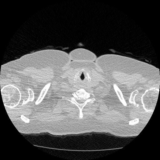
The LUNA16 challenge is a computer vision challenge essentially with the goal of finding ‘nodules’ in CT scans. It contains about 900 additional CT scans. In case you are not familiar, a ‘nodule’ is another word for a tumor. Here’s an example of a malignant nodule (highlighted in blue):

This is from a small 3D chunk of a full scan. To put this nodule in context, look at the first big .gif in this post.
Anyway, the LUNA16 dataset had some very crucial information - the locations in the LUNA CT scans of 1200 nodules. See, finding nodules in a CT scan is hard (for a computer). Very hard. An average CT scan is 30 x 30 x 40 centimeters cubed while an average nodule is 1cm cubed. This means that the average scan is 36,000 times larger in volume than the cancer we’re looking for. For an automated system with zero knowledge of human anatomy (and actually zero prior knowledge at all), figuring out which one or two areas in a scan really matter is a very hard task. It’s like showing someone a 150 page report (single-spaced) and telling them that there is one word misspelled that they need to find.
So this LUNA data was very important. To sweeten the deal, the LUNA dataset turns out to be a curated subset of a larger dataset called the LIDC-IDRI data. Now most of the information in these two datasets is the same, but the LIDC dataset has one thing that LUNA didn’t - radiologist descriptions of each nodule they found. The creators of the LUNA dataset threw out this data when they created their dataset (because it wasn’t relevant to them). However it is extremely relevant to the task of predicting cancer diagnosis.
So I downloaded the LIDC annotations and joined them onto the LUNA dataset. Ultimately this means that I had 1200 nodules and radiologist estimations of their properties. The properties that I chose to use were:
- nodule malignancy (obviously!)
- nodule diameter (size in mm, bigger is usually more cancerous)
- nodule spiculation (how ‘stringy’ a nodule is - more is worse)
- nodule lobulation (how ‘bubbly’ a nodule is - more is worse)
There is a report posted on the forums that describes some of the relationships between nodule attributes and malignancy.
Figuring out that the LIDC dataset had malignancy labels turned out to be one of the biggest separators between teams in the top 5 and the top 15. The 7th place team, for example, probably would have placed top 5 if they had seen that LIDC had malignancy.
The way I found the LIDC malignancy information is actually a funny story. A month into the competition, someone made a submission to the stage 1 leaderboard that was insanely good. In hindsight they were overfitting, but at the time I didn’t know this. I assumed they had discovered some great additional source of data so I dug around more and found the LIDC malignancy labels!
Julian proceeded in much the same way, and independently discovered and used the LUNA and malignancy annotations.
First Approaches
The beginning of a competition is the most interesting part, especially when there isn’t an obvious solution to the problem like this one. For at least a week I tried a few things without success, namely:
- Downsampling all the data to 128 x 128 x 128 mm and building ‘global’ models (NOT using the LUNA data)
- Breaking up the 1400 training scans into smaller chunks and trying to predict whether each chunk belonged to a cancer/noncancer scan
I think the third thing I tried was using the LUNA data. At first I built a model (using 64mm cube chunks) where the model was trained to predict the probability of a given chunk containing a nodule. Then to generate a prediction for a whole scan (remember 300 x 300 x 400 mm in size), I “rolled” my model over the whole scan to get a prediction at each location. To make sure not to miss any parts, the model needs to be scored a few hundred times.
Doing this gives you a 3D grid of ‘nodule probabilities’ (because the model predicts the probability of a nodule at each location). I then aggregated these with some simple stats like max, stdev, and the location of the max probability prediction.
With these simple stats, you can build a ‘regular’ model (Logistic Regression) to forecast the diagnosis. This model is trained and validated on the Kaggle DSB dataset.
After doing some initial tests on the training set (cross validation), I was expecting my leaderboard score to be around 0.482 (random guessing will get you 0.575). I did a submission and it scored 0.502 on the stage 1 leaderboard which was a little disappointing. However it was good enough to put me in the top 10 for a few days. And I finally found something that worked!
Pulling the Thread
Now that I had something that worked, I decided to see how far I could push it. There were a couple of no-brainer improvements that I made:
- Instead of predicting probability of a nodule existing, predict the size of the nodule (nodule size is in the LUNA dataset).
- Add data augmentation (described below)
- Improved model architecture (mainly added more batch norm)
- After discovering their existance, add LIDC features (malignancy especially)
- Improved aggregation of chunk predictions
- Improving final diagnosis model (Logistic Regression + Extra Trees)
Doing all this improved my cross-validation score (my estimated leaderboard score) to 0.433! So naturally I did a submission and it came out significantly worse at 0.460.
Data Augmentation
What if I told you you could have an infinite amount of data to build your models on? Well with Data Augmentation™ you can!
Data augmentation is a crucial but subtle part of my solution, and in general is one of the reasons that neural networks are so great for computer vision problems. It’s the reason that I am able to build models on only 1200 samples (nodules) and have them work very well (normal computer vision datasets have 10,000 - 10,000,000 images).
The idea is this - there are certain transformations that you can apply to your data which don’t really ‘change’ it, but they change the way it looks. Look at these two pictures:
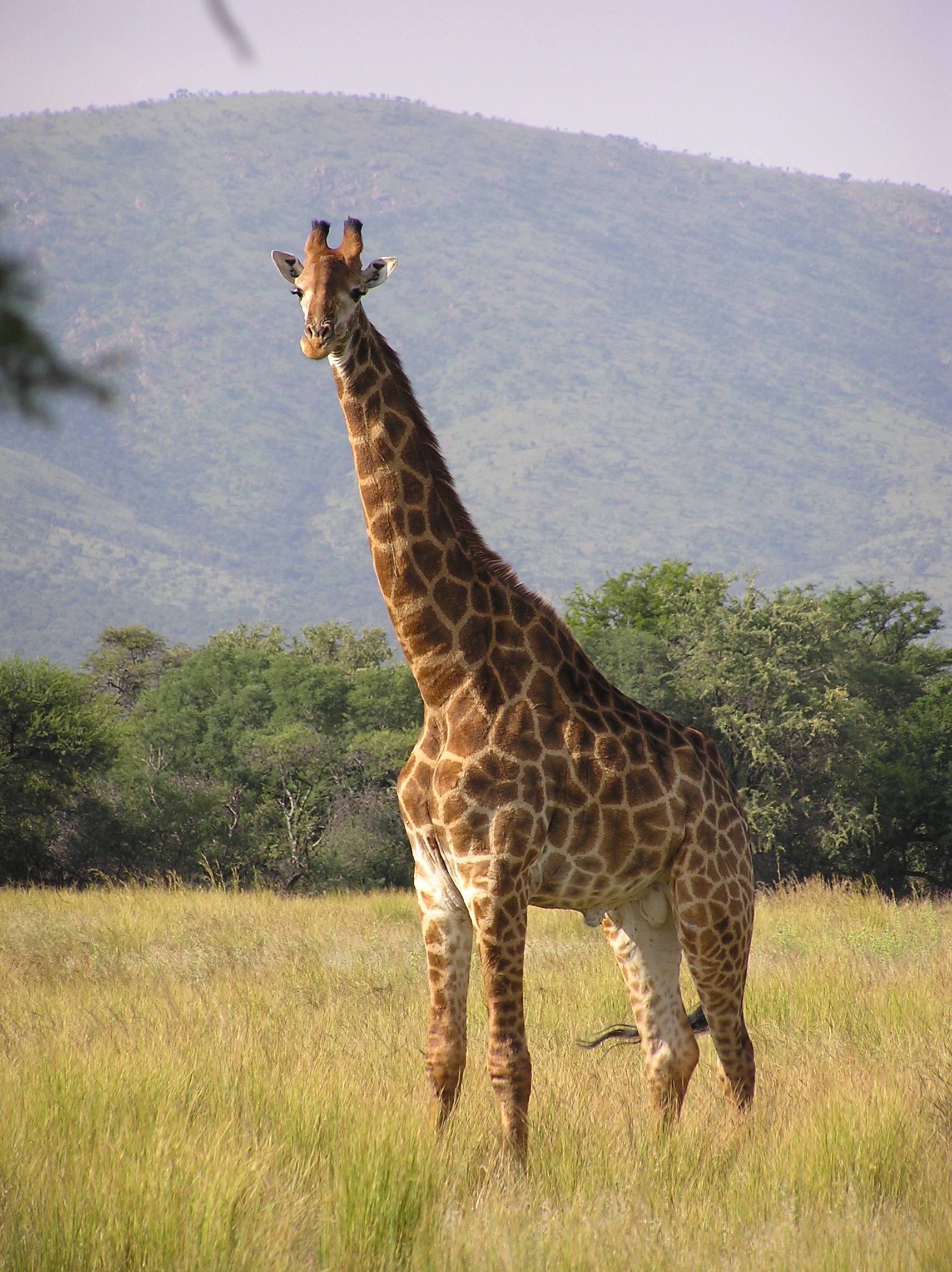
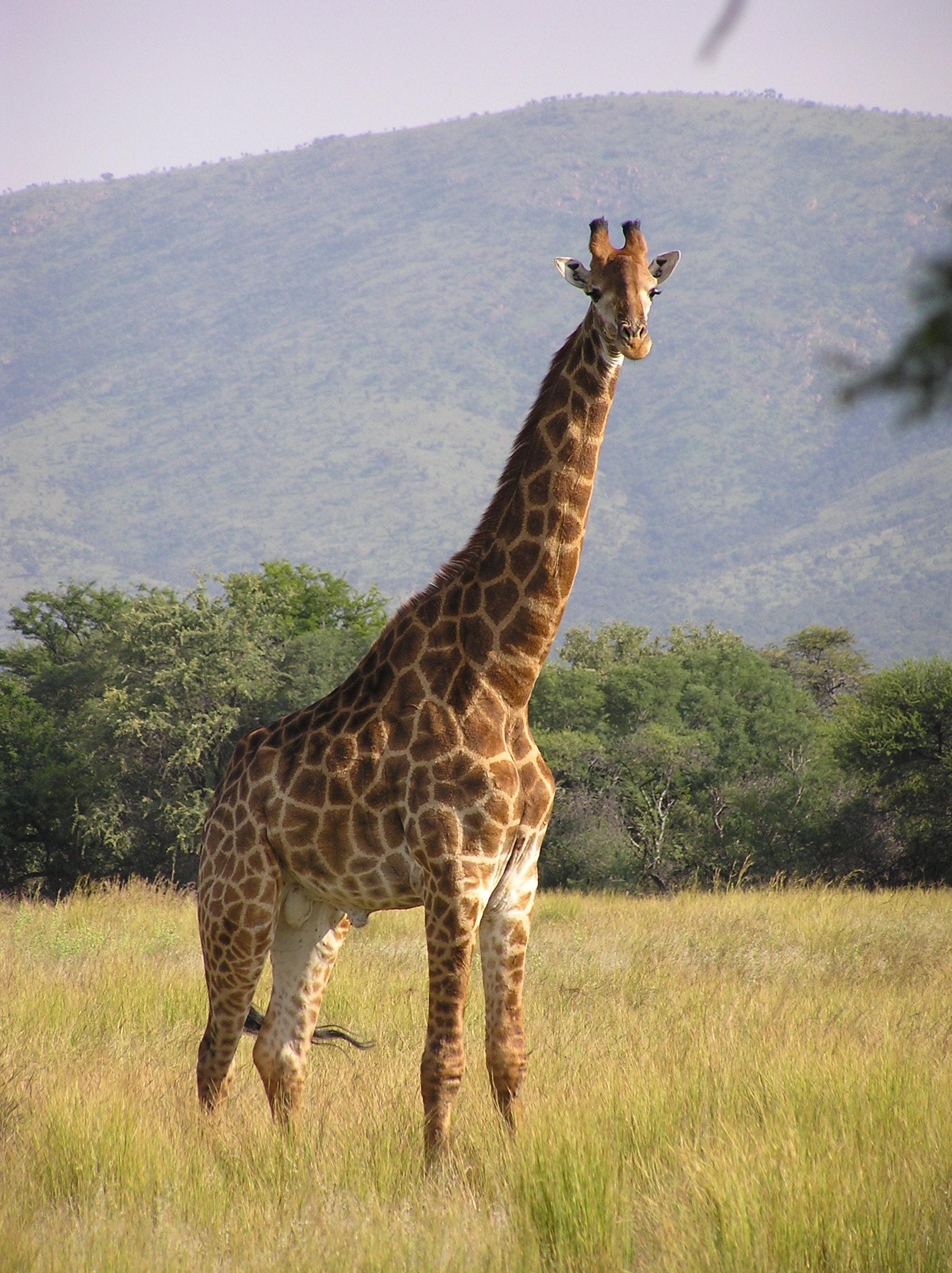
They’re both giraffes! However to a neural network model these are totally different inputs. It might think one is a giraffe and another is a lion.
Mirroring is an example of a ‘lossless transformation’ of an image. Lossless here is in terms of information - you don’t lose any information when you mirror an image. This is opposed to ‘lossy transformations’ which do throw away some information. A rotation by 10 degrees is an example of a lossy transformation - some of the pixels will get a little messed up but the overall spirit of the image is the same.
With 3D images, there are tons of transformations you can use, both lossy and lossless. This sort of thing is studied in a branch of mathematics called Group Theory, but just using some quick googling we can find out that there are 48 unique lossless permutations of 3D images as opposed to only 8 for 2D images! In both 2D and 3D there are an infinite number of lossy transformations as well.
Here’s a cool graphic of the lossless permutations of a 2D image:

So how does this help us? Well each time before showing a chunk from a CT scan to the model, the chunk can be transformed so that it’s ‘meaning’ remains the same but it looks different. This teaches our model to ignore the exact way an image is presented and instead focus on the unchanging information contained in the image. We say that the model becomes ‘invariant’ to the transformations we use which means that applying those transformations will no longer change it’s prediction.
However the model, like some people I know, isn’t perfect. Sometimes if you rotate an image in a certain way, the model will change its prediction of malignancy a little. To exploit this, you can show an image to the model a bunch of times with different random transformations and average the predictions it gives you. This is called “test time augmentation” and is another trick I used to improve performance.
All the top competitors including Julian and I used data augmentation heavily. Some teams only used 2d augmentation which I believe limited their performance.
Leaderboard Woes
One of the most difficult parts of this competition was the small number of CT scans available. The first stage leaderboard, for example, used only 200 scans. Furthermore, only 25% (50 of them) showed lung cancer. Because of this, the leaderboard feedback for the first 3 months of the competition was extremely noisy. You could obtain a very good score on the leaderboard by just making lots of submissions and keeping the best one. To counteract this, Kaggle made the competition have two stages. The first stage went on for 3 months and the second stage went on for a few days. The data for the second stage wasn’t released until the first stage ended, and you had to submit your finalized model to Kaggle before the second stage started. This means there was no way to manually label the second stage data to gain an advantage. The second stage also had more data (500 scans) so the final leaderboard was more reliable than the first stage. You can read more about the competition format here.
Because the competition was strucured this way, I really had no idea how good my solution was compared to everyone else until it was over. It was very tough to make small improvements while watching people leap way above me on the leaderboard. I think at the end of the first stage I was probably between 30th and 40th on the leaderboard.
One other implication of the leaderboard noise is that it is nearly impossible to team up with someone unless you have worked with them before. Julian and I were lucky to have both worked together before so we each knew that the other was unlikely to have just overfit the public leaderboard.
The Middle
I spent the remainder of the competition fine tuning this basic approach. A lot of experimentation was done with the objective function for the models, what fraction of nodules/non-nodules to use in training, and the best way to generate a global diagnosis from the nodule predictions.
I also came up with a neat trick for speeding up the training of my models during this phase. During experimentation, I found that if you build models on 32x32x32 mm crops of nodules they train much faster and achieve much better accuracy. However when you want to apply that model across a full scan, you have to evaluate it something crazy like 3000 times. Each time the model is evaluated at a location there is a chance of a false positive, so more evaluations is definitely not desirable. Building 64x64x64 models, on the other hand, takes longer and isn’t quite as good at describing nodules but ultimately works better. Comparing the two, the 64 sized model requires 8x fewer evaluations than the 32 sized model while only being slightly less accurate.
A reasonable question to ask at this point is - why not bigger than 64? Well I tried that. It turns out that 64 is a sort of ‘sweet spot’ in chunk size. Remember that our models rely heavily on exploiting the symmetries of 3D space. Well it turns out that the lungs in general aren’t that symmetric. So if you keep making your chunk size larger, data augmentation becomes less effective. I do believe that a chunk size of 128 could work, but I didn’t have the patience to train models of that size as it generally takes 8x longer than 64 sized models.
Anyway, one of the nice things about the architecture that I used was that the model can be trained on any sized input (of at least 32x32x32 in size). This is because the last pooling layer in my model is a global max pooling layer which returns a fixed length output no matter the input size. Because of this, I am able to use ‘curriculum learning’ to speed up model training.
Curriculum learning is a technique in machine learning where a model is first trained on simpler or easier samples before gradually progressing to harder samples (much like human learning). Since the 32x32x32 chunks are easier/faster to train on than 64x64x64, I train the models on size 32 chunks first and then 64 chunks after.
Julian, through some sort of sorcery or perhaps black magic, was able to make 32mm^3 models work. Actually his black magic is a multi-resolution approach which you can read about in his blog post.
Teamwork
With about 3 weeks left I the competition I decided to team up with Julian de Wit. I had worked with Julian on a competition before, and we were both worried that we didn’t stand a chance alone. Julian is an excellent data scientist and had a solution to this problem which was quite similar to mine. You can read about his solution here.
The method we used to combine our solutions ended up being quite simple - both of our systems made diagnoses for each patient and then we just averaged them. Our solutions were approximately equal in strength, and if I had to estimate we probably both would have ended up between 6th and 8th place if we competed individually. One second place solution for two 7th place solutions is a pretty good trade off!
I was fortunate that Julian entered the competition. Normally in a Kaggle competition, it is easy to see who has a good solution and who doesn’t - and obviously you can ask others with good solutions to team up. However in this competition, due to how unreliable the stage 1 leaderboard was (as mentioned above), there’s no way I could have teamed up with someone new. Because I had worked with Julian on a prior competition, I knew he was good so I could trust his results.
Ensembling
Ensembling is another common sense trick widely used in Kaggle competitions (and the real world). The idea is simple - if you want to get a better answer then you should ask several people and consider all their answers. And if you want to get better cancer predictions, you should build a bunch of different cancer models and average them!

This strategy works best when the answers (predictions) are both accurate and diverse. With knowledge of this phenomenon, I spent the last few weeks of the competition trying to build lots of models which were as accurate as my best but used different settings (to add diversity). For those with a background in training neural nets, the parameters that were tweaked to get diversity were:
- the subset of data the model was trained on (random 75%)
- activation function (relu/leakly relu mostly)
- loss function and weights on loss objectives
- training length/schedule
- model layer sizes
- model connection/branching structure
Ultimately I built two ‘ensembles’ of models. The first ensemble I built really in an ad-hoc manner - during the process of tuning my neural net structure I trained a bunch of models. Many of them turned out to have similar performance, so I threw them all into an ensemble. This ensemble had a CV score of 0.41 (remember the prior best was 0.433 - averaging helps!).
The second ensemble was more systematic (described below). Julian also built several models and ensembled them as part of his solution.
The Nuclear Option
Once I decided that I wasn’t going to make any more breakthroughs, I set my sights on building a second ensemble with as many good models as possible. To speed things up, I decided to experiment with an AWS GPU instance (p2.xlarge, comes with a NVIDIA K80 GPU). This turned out to be a great decision. It only took me a few hours to set up using the deep learning AMI they provide, and I found that suddenly my models trained 5x faster! (Nvidia and Amazon - I will accept a new 1080Ti GPU as payment for this product placement).
I still don’t know for sure why my models train so much faster on AWS compared to my PC at home (Titan X). The current leading theory is that I have PCI v2 in my motherboard which is limiting the GPU to CPU bandwidth. Anyway, I was suddenly able to train 5 models in the time that it had originally taken me to train one. So naturally I made each model bigger so that they no longer trained any faster :)
At this point in the competition I had a pretty good feel for what worked and what didn’t in terms of neural network models. I ended up building 6 new models. Each one had a CV score of around 0.4 to 0.41, and when all combined they scored 0.390 in local cross-validation!
Wrapping Up
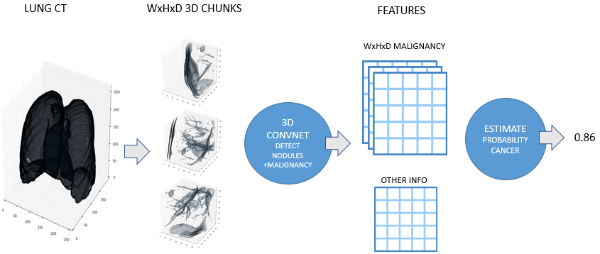
By the end of the competition, I had a pretty good pipeline set up for transforming a CT scan into a cancer diagnosis. The steps are:
- Normalize scan (see Preprocessing above)
- Discard regions which appear normal or are irrelevant
- Predict nodule attributes (e.g. size, malignancy) in abnormal regions using a big ensemble of models
- Combine nodule attribute predictions into a diagnosis (probability of cancer)
Julian developed a very similar approach independently for his solution. Here is a high level overview image from his blog post:
Scan preprocessing didn’t change significantly throughout the competition. However one of the later additions was an ‘abnormality’ detector.
Detecting Abnormalities in CT Scans
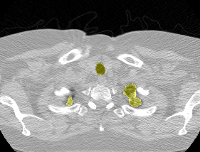
The vast majority of every CT scan is not useful in diagnosing lung cancer. There are several reasons for this, but most obvious is that much of the CT scan data is covering locations outside the lungs! The below .gif shows a typical CT scan before being cropped. The lungs are the big black spaces - note how a large portion of the scan doesn’t overlap with the lung interior at all.
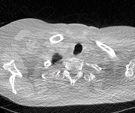
I found some code for doing ‘lung segmentation’ on the Kaggle forum. The idea behind lung segmentation is simple - identify the regions in the scan which are inside the lung. Here’s what a scan looks like after finding the interior (in yellow) and cropping out the parts of the scan which don’t overlap with the interior:
So far, so easy. Now it gets trickier. Next I broke up the CT scan into small overlapping blocks. I then fed each block (of size 64 mm cubed) into a small version of my nodule attribute model (a neural network). This model is specifically designed not to be super accurate at describing nodules, but to be good at not missing any nodules. In technical terms, it has high sensitivity. This means that it likely returns lots of ‘false positives’, or regions which don’t actually contain nodules. On the other hand, it shouldn’t miss any true nodules.
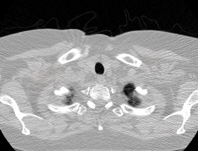
Here’s a CT scan with the ‘abnormal’ blocks highlighted in red.
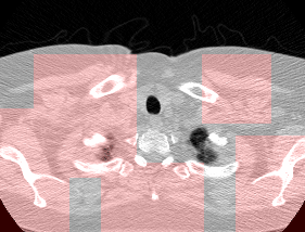
This process ultimately reduces the volume that we need to search by 8x. Skipping this step is possible but it would increase the time it takes to process each scan significnatly. This step is extra impactful because I use large ensembles next.
Predicting Nodule Attributes
After discarding the majority of the CT scan, it’s time to use the big ensembles of neural networks on what’s left. For each block idenfitied as ‘abnormal’ by the prior step, I run it through all of the nodule models. Because each model was trained with different settings, parameters, data, and objectives, each model gives a slightly different prediction. Also each model is shown each block several times with random transformations applied (as dicussed in the data augmentation section above). Predictions are averaged across random transformations but not across models (yet).
Here are some examples of ‘suspicious blocks’ which turned out to have malignant nodules. These are colored based on how important each part of the block is to the malignancy prediction for the entire block.

The output of this stage is one prediction per model per suspicious region in the image. These become the inputs to the next part of the pipeline which produces the actual diagnosis.
Diagnosis
Forming a diagnosis from the CNN model outputs turned out to be quite easy. Remember at this point we have model predictions of several attributes (nodule malignancy, size, spiculation) at many different places in each scan. To combine all these into a single diagnosis, I created some simple aggregates:
- max malignancy/spiculation/lobulation/diameter
- stdev malignancy/spiculation/lobulation/diameter
- location in scan of most malignant nodule
- some other clustering features that didn’t prove useful
These features are fed into a linear model for classification. Below is a feature importance plot, with the Y-axis showing the increase in log-loss when the specified feature was randomly scrambled:
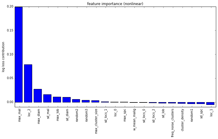
I have added some purely random features into this analysis to provide an idea of significance. It’s fairly clear from this that the max malignancy prediction is the most important feature. Another very important feature is the location of the most malignant nodule in the Z dimension (i.e. closer to head or closer to feet). This is also a finding that I saw in the medical literature so it’s pretty neat to independently confirm their research.
Very late in the competition, my teammate Julian came up with a new feature to add to the diagnosis model - the amount of ‘abnormal mass’ in each scan. I added this to my set of features but neither of us really had enough time to really vet it - we both think it helped slightly. If you are interested in reading more about Julian’s approach, check out his blog post here.
The End
That’s it! The code for my solution is on my GitHub page, Julians part is on his Github, and my technical writeup is here. Feel free to reach out if you have any questions. If you got this far then you’ll probably also enjoy reading Julian’s solution here.
Thanks
Kaggle & Booz Allen Hamilton - it was a very interesting competition. We were also encouraged by the hope that our solution to this problem will be more widely useful than just winning some money in a competition - hopefully it can be used to help people!
Julian - Julian was a great teammate and is an excellent machine-learning engineer. He does consulting work so definitely keep him in mind if you have a project that requires some machine intelligence.
Open source contributors to Python libraries - there’s no way we could have achieved this in such a short time without all the well-written open-source libraries available to us.
My girlfriend - thanks for being understanding while I spent nearly every minute of my free time on this project.
Bios
Julian De Wit is a freelance software/machine learning engineer from the Netherlands.
Daniel Hammack is a machine learning researcher from the USA working in quantitative finance.